New look SBK™: a sneak peek at what's to come in 2022
After a thrilling 2021 season, the future is brighter, bolder and more emblematic with a refreshed Brand Identity
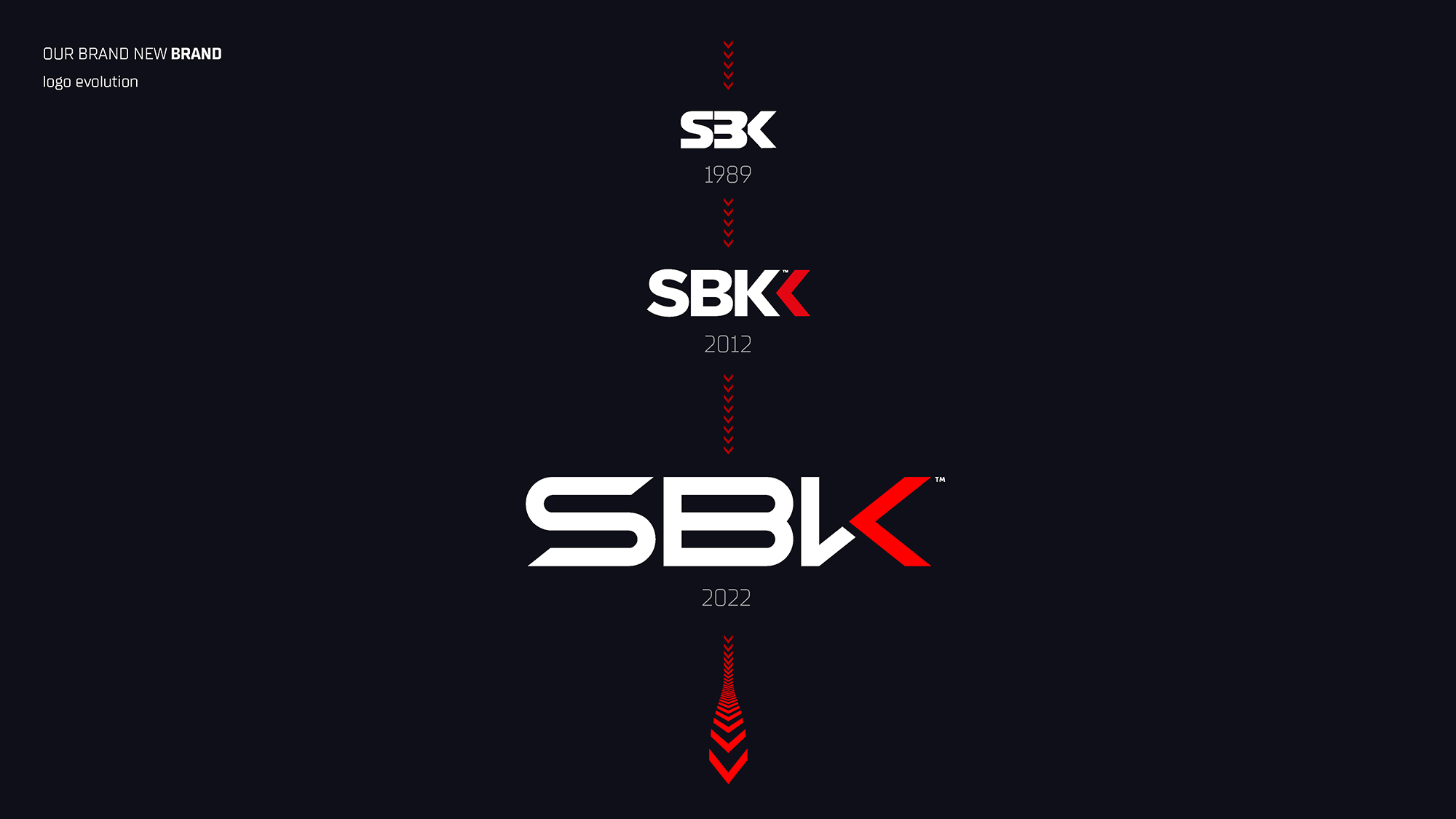
As the curtains close on a historic 2021 campaign, Dorna WSBK Organization (DWO) is looking towards bolstering the SBK™ brand with the introduction of a new logo and refreshed Brand Identity. The new look logo, developed with International creative agency Designwerk, is a deliberate evolution of the previous design introduced in 2012 to better reflect the values of the MOTUL FIM Superbike World Championship and work seamlessly across all digital and physical channels.
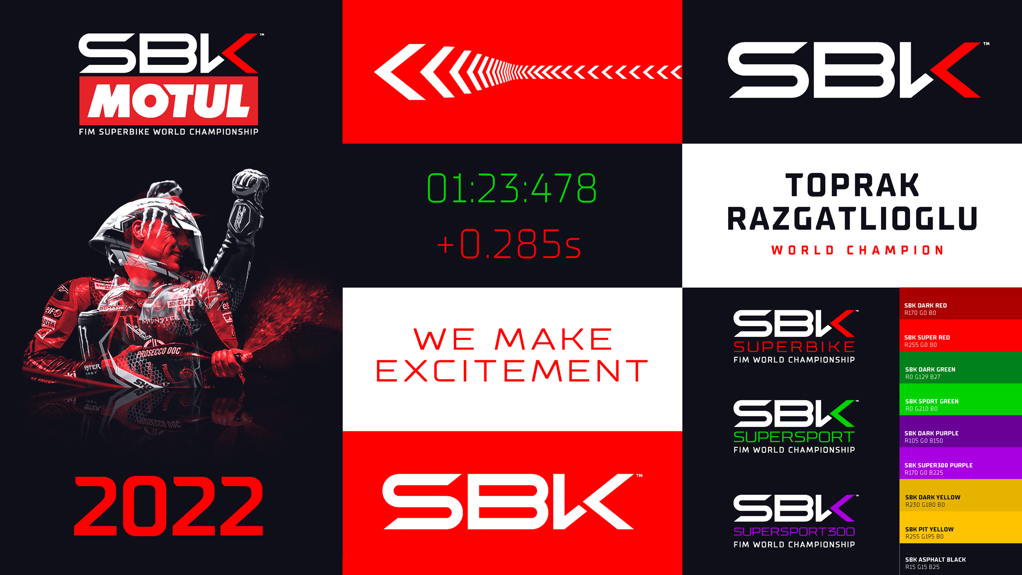
The refreshed brand identity also includes a streamlined and vibrant colour palette, a new graphic language and the adoption of a new typography which will be introduced across all platforms for the 2022 season.
While WorldSBK established itself as the third most popular motorsport Championship after F1® and MotoGP™ in terms of audience, a thrilling 2021 title battle also meant the Championship featured regularly among the fastest growing digital communities within the industry.
Beyond the traditional dynamic and modern traits of SBK™, the new logo is more in phase with the younger and ever so engaged audience the brand reaches, yet maintains a strong link with its predecessor, incorporating a refined integration of the trademark "Chevron" shape.
As 2022 promises to cement the emergence of new stars in the WorldSBK class while WorldSSP and WorldSSP300 undergo important evolutions, there couldn't be a better time to venture into a new direction that will go well beyond the brand’s logo.
Francesco Valentino, Head of WorldSBK Commercial & Marketing, commented: "The refresh of our Brand Identity has meant a step further towards times to come, along with our fans, whilst preserving our traditional Brand Image made of passion, energy and spontaneity. A brand refresh is a major undertaking and we're pleased to have reached our goals: the need for a consistent and coherent visual language for all the channels our brand is present on was obvious. The evolution of our logo and overall Brand Identity remains true to our core values while assimilating the ways our fans interact with SBK™, watching it on TV, playing it as a videogame or enjoying it on social media. More than ever, we make excitement."


